The Future of Minimalist UI Design in 2025
Google’s UX research shows when a design is too complex, users rate it less beautiful. But if it’s simple and familiar, it scores very high.
Their study also shows that first impressions of a website form incredibly fast, between 17 and 50 milliseconds, and two big factors shape that judgment: visual complexity and prototypicality
If you’ve ever opened an app or website that just made sense right away, no clutter, no confusion, nothing extra, then you’ve already experienced minimalist design. Think about Google’s homepage: one logo, one search box, and that’s pretty much it.
Design styles change often, and technology moves even faster. So, what’s next for minimalism? Will it stay sleek and simple, or take on a new direction?
It’s Not Only About Looking Simple
Google’s UX research shows that users judge a design within 50 milliseconds, and prefer interfaces with low visual complexity and high familiarity, meaning minimalism must be not just clean, but intuitive.
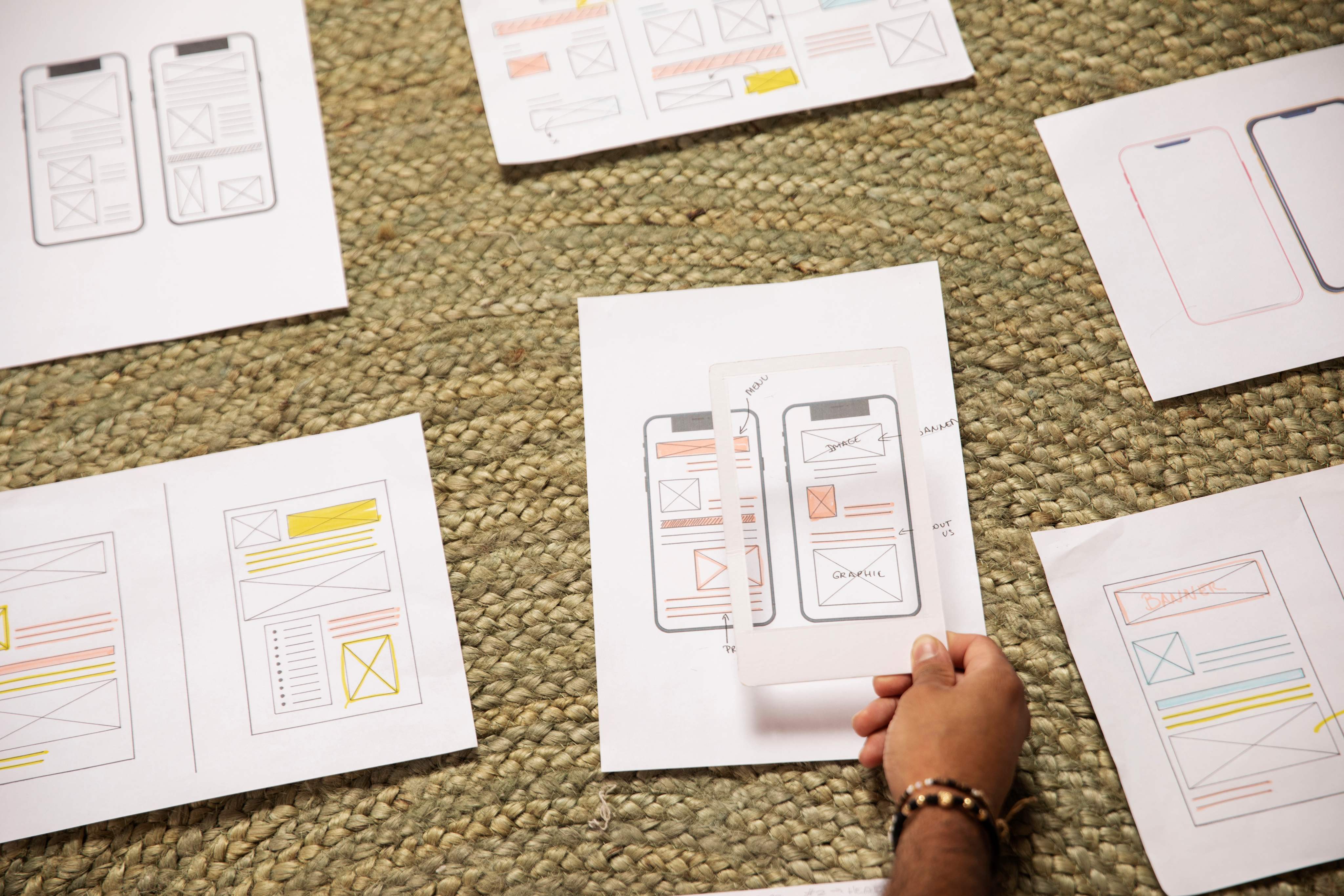
Minimalism used to be mostly about appearance, clean shapes, basic icons, and plenty of open space. Everything looked neat, but ironically, many “minimal” interfaces were not the easiest to use.
Modern designers now focus just as much on how something feels to use as how it looks. Real minimalism isn’t about removing elements, it’s about removing friction. You can see this shift in everyday apps.
Take a food-delivery app:
When it instantly shows the restaurants, you order from most, that’s functional minimalism. No digging through menus. No extra choices slowing you down.
Just: open → tap → order.
Calm Technology
The concept was introduced by Mark Weiser in at Xerox PARC, who famously wrote that “the most profound technologies are those that disappear.”
Like Siri, Alexa, or Google Assistant.
You don’t swipe, scroll, or tap, you just talk.
The interface disappears, and the interaction becomes natural.
Your lights turning on as you enter the room.
Parking barricade lifts the moment your barcode is scanned.
Waving your hand to open automatic doors.
These are all examples of invisible design, where technology quietly does its job without demanding your attention.
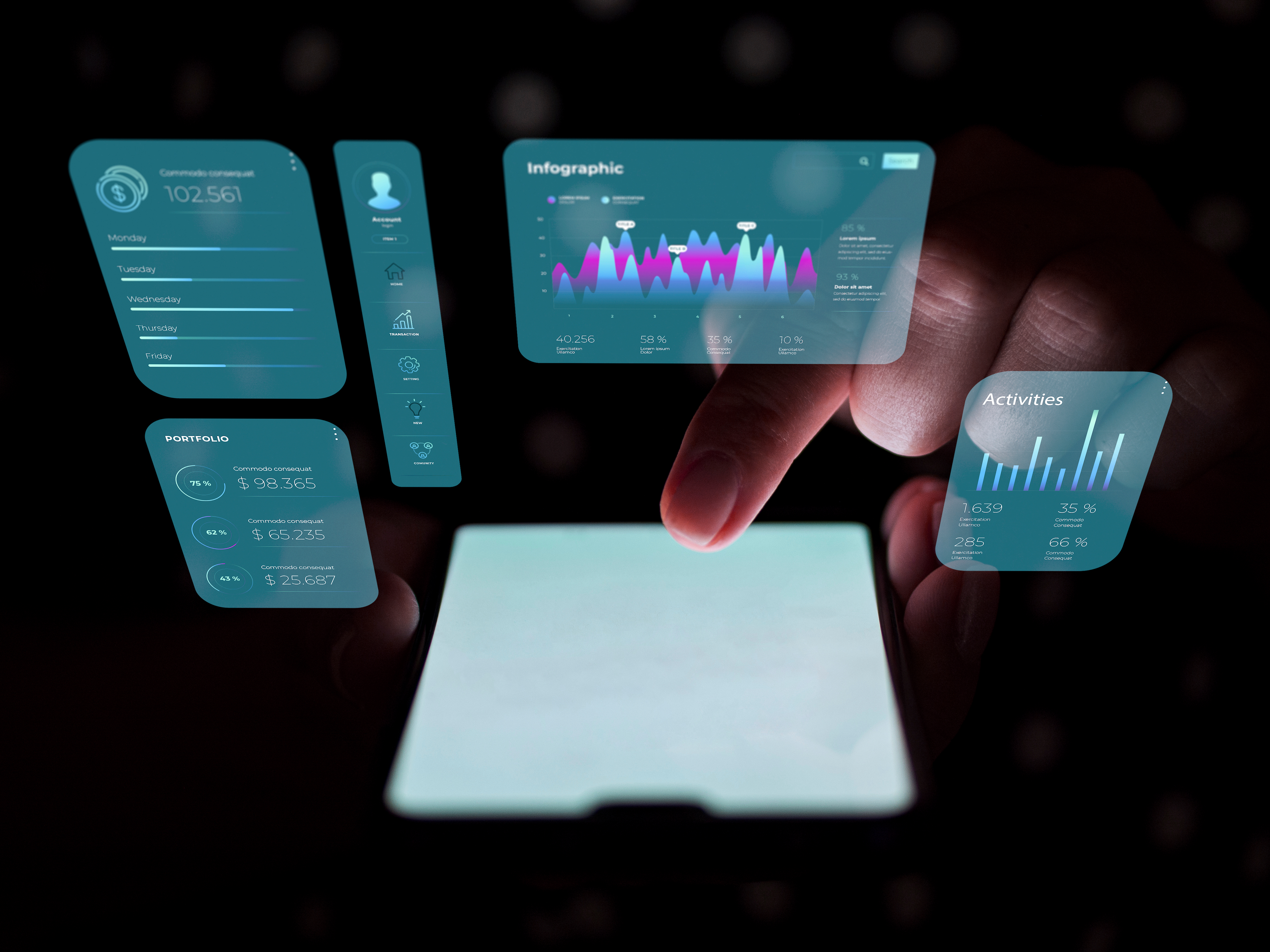
Personalized and Simple
Minimalism is also getting more personal. With AI, apps can pick up on your habits and adjust what they show you.
A 2024 study on mobile learning apps found that using an adaptive UI increased:
Task completion by 22%
Daily usage time
Overall usability ratings
One study showed adaptive UIs helped seniors, but only when changes were predictable.
New system, SituationAdapt, adjusts mixed reality interfaces based on objects, people, or environments in your field of view.
This approach is called Adaptive Minimalism, an interface that sees, learns, and responds.
Calm, Friendly, and Human
Minimalism isn’t only about empty spaces and simple shapes. It can also create a feeling.
Soft colors and clean layouts can instantly make an app feel relaxing.
A 2023 study using “Dual N-Back Tasks” found that interfaces that minimize unnecessary visual elements reduce mental workload.
Ergonomic design principles are also key:
Researchers found that applying cognitive ergonomics, like strategic use of color and spacing, leads to more intuitive, accessible UIs and lower memory strain.
On the emotional front, modern AI research has introduced emotion-aware UIs, which recognize user's feelings (via facial expressions, posture, or speech) to gently adapt the interface in real time.
In short, minimalism isn’t just about simplicity, when done right, it can feel warm, thoughtful, and deeply human.
Minimalism Helps the Planet, Too
Here’s a surprising bonus: simple designs are also eco-friendly.
Digital technologies are estimated to contribute around 4% of global CO₂ emissions.

The Website Carbon Calculator estimates that the median web page emits around 0.8 grams of CO₂ per page view.
More complex or media-heavy site can produce up to 1.76 g CO₂ per page view.
Designers can reduce this footprint by compressing images, minimizing scripts, and avoiding autoplay media. Lightweight UI’s also mean fewer server requests and lower computational load, which further saves energy.
Minimalist designs also stay relevant longer because they aren’t based on fast-changing trends. That means fewer redesigns and less digital waste.
Minimalism in New Tech (AR, VR & Beyond)
Technologies that blend digital and physical worlds. While they seem complex, minimalism is actually what makes them usable.
A 2021 study found that immersive visualization using VR head- mounted displays, was more usable and more motivating than 2D screens.
Excessive visual complexity raises cognitive load, reduce performance, and even contribute to motion sickness. A very recent VR study (2025) also shows that reducing “visual stimulation intensity” decreases cognitive load and visual fatigue, improving user performance.
Research on AR/VR accessibility argues that interfaces should “present relevant information in a clear and concise manner”, avoid overloading the user with too many interactive or visual elements at once.
This minimalistic approach helps people navigate better.
Across AR, VR, and (smart watch, smart ring) wearable tech, minimalism isn’t just a design choice, it’s a necessity for clarity, comfort, and better human-tech interaction.
A Look That Stays Timeless
Minimalism in UI design isn’t just a style, it’s cognitive science and has proven benefits.
Research shows that reducing visual clutter significantly lowers cognitive load, which helps users think more clearly and feel less overwhelmed.
Experts also point out that humans can only hold a few things in working memory at one time. When a design is simple, the brain feels less stressed and more comfortable.
Minimalism isn’t likely to fade because it’s intentional design: every element has a purpose, which means less noise, fewer distractions, and more focus. As technology gets more powerful and complex under the hood, minimalist interfaces will continue to deliver calm, human experiences.
This website is Sustainable, Fast & Privacy-friendly.
97/100
Sustainable Score
100%
Renewable Energy
0.2 sec
Page Load Speed
Zero
Cookies, & tracking
Follow Us
Our Website Score
Green Web Foundation

Our SDG


We are members of


A brand of Venzo Technologies❤
Copyrights Reserved @ Kytz